finally FINALLYYYYY I MAKE AN ART PAGE YAY!!!!!!!! i thought it would never come to this lol
ok so the dealio was that I just so happened to download all my art projects from my art class for my portfolio and i was like "hey! I have all these things laying around, why should I delete them? Might as well put 'em on my website!" and.... Here we are now!
expect this page to never be fully finished. I'll always add some more stuff ofc but it's gonna be very sparce because i'm so freaking busy all da time ugh

My Design Journal!
In my art class (specifically in art 2), we have these things called 'Design Journals' that are reused books for collaging in assignments called 'Spreads'. You with me? ok cool  I fucking go so hard with these I LOVE COLLAGING!!!!!!!!! I mmmmmmmmmmmmmmmmmmmmight post my spreads from my other sketchbooks but ehh I don't think so oh well
Front Cover
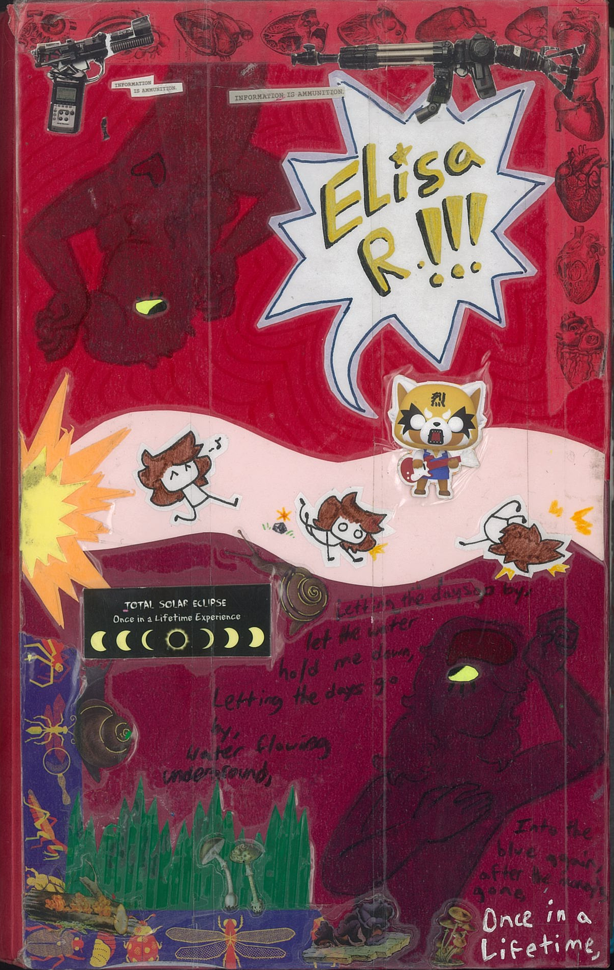
I was kinda going for a "flesh and mind" theme with the cover of my design journal and i freaking cooked bro I cooked!!! But fun fact: this wasn't actually supposed to be the front cover. It's only the front cover because I messed up LOL XD I'll explain it more under the back cover but 4 now you don't know.
I kinda zoned out while making it. There's a bunch of random stuff on it like the washi tape I got from New Mexico (long story) and the chorus lyrics from Once In A Lifetime by The Talking Heads. The 'guns' on the top of the cover are magazine cut outs that are actually a bunch of camera equipment and there's supposed to be something reading "Information is ammunition" but i think it somehow rippped or something. Damn. Those figures on the top and bottom are kinda meant to be me but it's very loosely based. It's kinda just more for random symbolic meaning but it really doesn't matter. It's whatever. :p
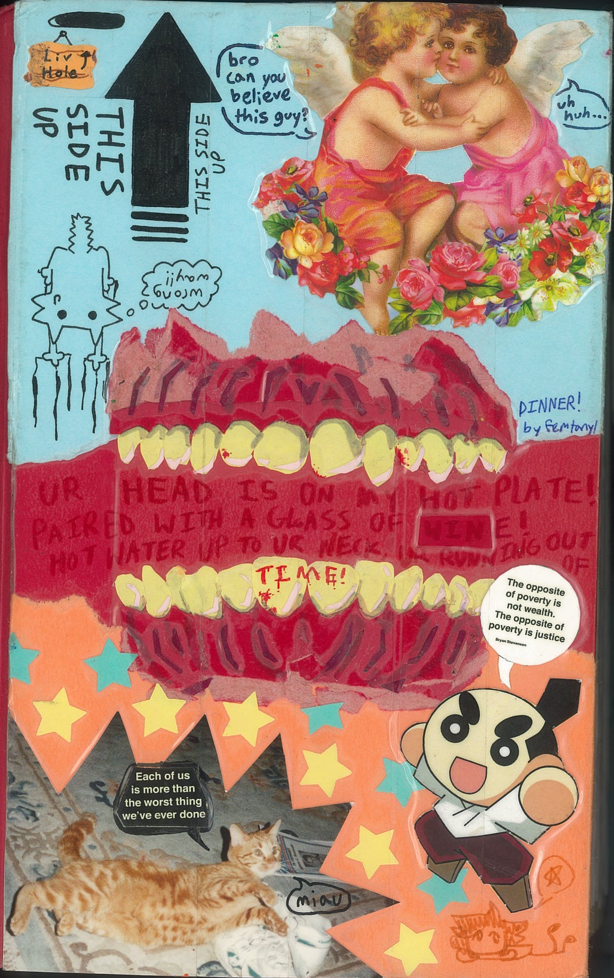
Back Cover
My initial idea was to make the teeth in the center of the cover and it was supposed to look super cool and shit but then I went and made it upside down. My stupidity strikes again. Damn actually how did I fumble that bad it's actually insane
But I clutched it!! I managed to clutch it by just flipping it right side up and doing the other part like nothing happened and I guess it worked?? You can barely tell anyways. But anyways I like this cover a lot. The lyrics inside the mouth are from "DINNER!" by femtanyl and the deco is a bunch of scraps that I had laying around. In da orange part are quotes from Bryan Stevenson my GOAT!!! look him up or read Just Mercy its peak but anyways I wanted a bit more chaos (? I guess) so I added the quotes from the package of some stickers that said the same thing with the picture of the cat I got from my local art reuse store and the mascot of Kura (the rotating sushi bar). For the blue part I had this postcard with the angels so I took the front of it and painstakingly cut it out to glue :) And to stop my dumbassery from striking again, I put the "This Side Up" with my oc (the cat named Liv) being dragged into the Liv Hole. It makes me laugh. I think I did a pretty good job! I like it :D
Inside Cover
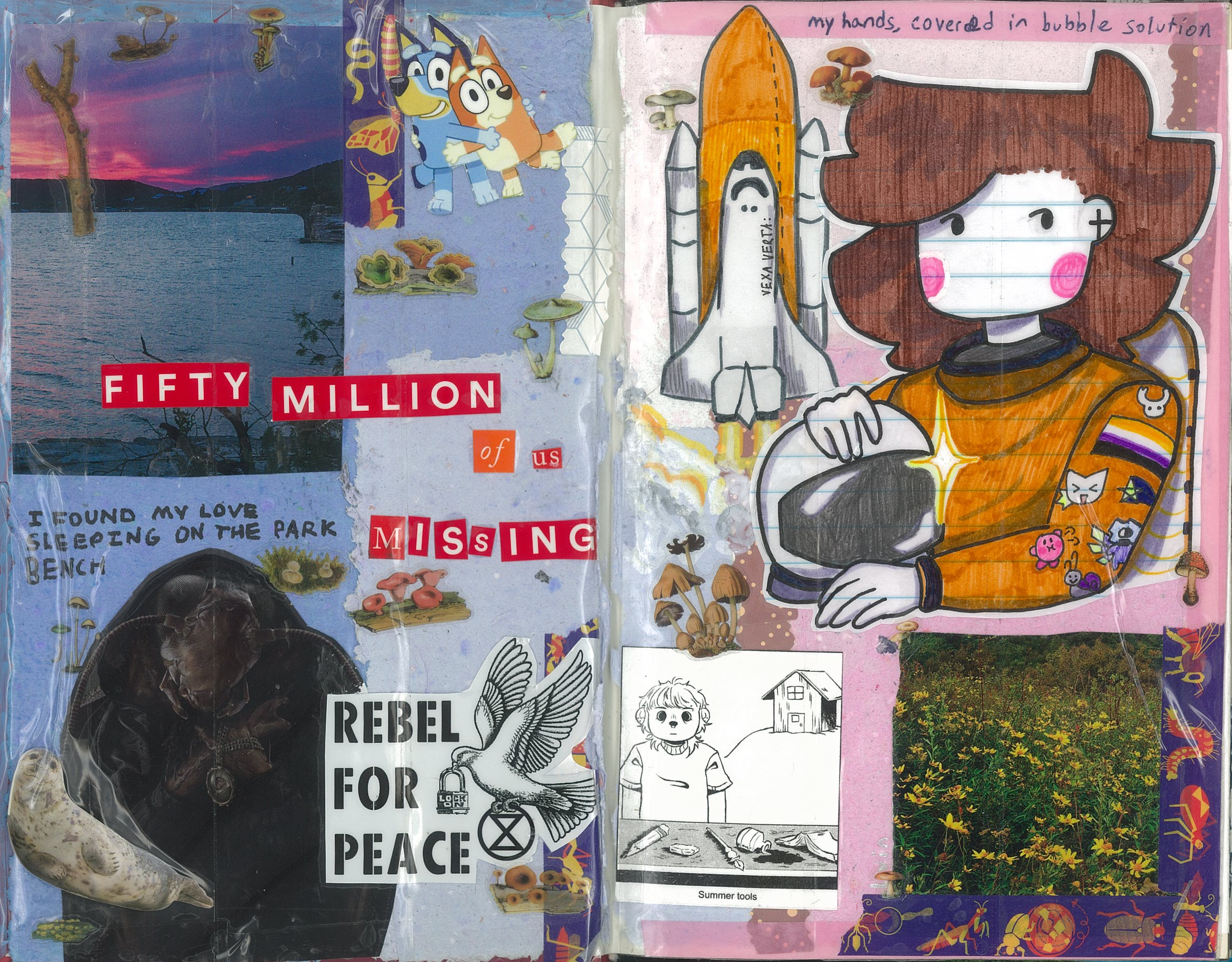
Now inside the cover, we had to put a drawn portrait of us that represented us and what we liked so that's why I'm there as an astronaut. Pretty neat, right? :D The rest is mostly scraps, I used the cover of the book used for the Design Journal in that "Fifty million of us missing" that I think is pretty cool. I put the titles of some of my poems around to fill in empty space. On the sleeve of my astronaut suit is the non-binary flag, obvi, and also Kirby, Token (aka femtanyl), The Knight from Hollow Knight, and V1 from Ultrakill. And a random snail and star.
This spread is kinda filler. I don't really care much for it but it's still nice to look at I guess.
Spread 1: "Emotional Time"
The theme of this spread was an emotional moment in our lives. I chose to do my family's move from New York to Texas when I was like 6. It was a very drastic moment in my life, and a very nerve-wracking/ melacholy time too. The once familiar notion of a giant city with blinking lights and so much to see being replaced with something unknown to me. And my feelings about living in Texas and wanting to move away really show in this spread.
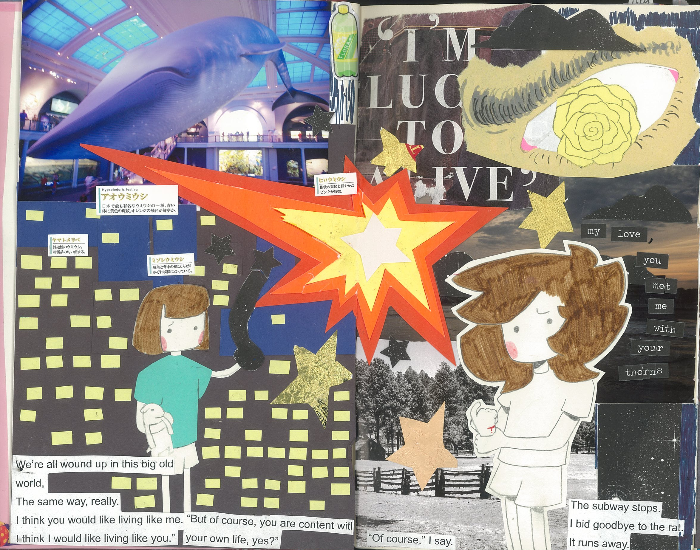
On the left side of the spread, I used a lot of sticky notes and scrap paper for the city and also the younger me which is made up of multiple pieces of paper. The picture of the blue whale from the New York Museum of Natural History taken by my dad like a while back. The random boxes with japanese text are from a sea slug sticker set, so they're not really important. The poem lines on the bottom are from my actual poem titled "Living In The Subway System" that I wrote on a visit to New York. Its about me and a rat and learning different perspectives but I don't wanna copy the whole poem in here, I'll do it later. (aka never) On the right side is just magazine scraps I got from a library and the eye is scrap paper from my school's art room. It's the yellow rose (cus get it? Texas is the yellow rose...? ok nvm) and like it's supposed to be symbolic but it also looks nice so that's a plus. :p And the random words "My love, you met me with your thorns" is a poem title that's basically what this spread was based on. I really like how this spread turn out, especially for a first one. :)
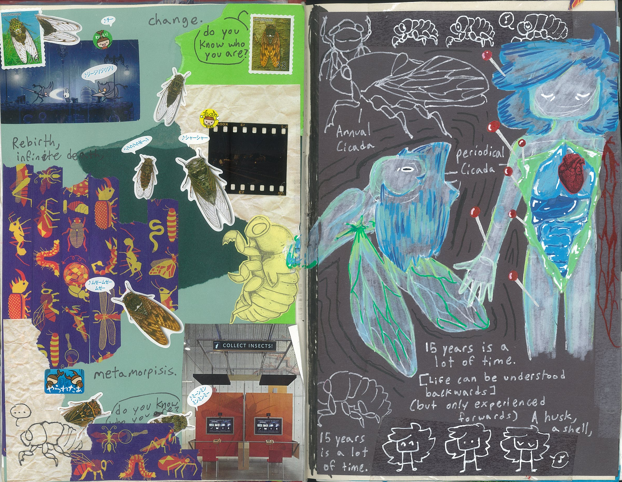
THIS SPREAD HAS MODERATE GORE IN IT!! just lettin you know
Spread 2: "Favorite Animal"
So my favorite animal is the cicada and I chose to interpret it in a more uhh metaphorical sense?? I was sick for like a good majority of the school days I was supposed to make this spread in so I had way more time on my hands to lock in. You know how some cicadas emerge once in every 17 years or something? I've always had this feeling that I'm never the same person, that I'm always growing and shedding the 'old' version of myself, and yet it still stays with me even after all these years. After all, 16 years is a lot of time. (ignore how it says 15 I made this spread before I turned 16 so that's why it says that ughhh) This one was also based on a poem who would've guessed called "Oh, Cicada Shell" which is about growing up and changing. I'm realizing now that a lot of my poems are about growing up and the fear of the future....I'm sure that's nothing
I used a ton of scrap paper for the background because I need to cover the middle seam, and my brother had these bug stickers so I used a ton of the cicada ones. And more magazine scraps from the library!! Yay :) And for the right side, I used these (lowkey kinda shitty) paint markers in order to portray the freshly-shed cicada skin for my sona. Some random white and red markers and like boom it's done. I really like this one because it's very jarring despite what it's portraying, like, portraying the fear of growing and the future in its most apparent and brutal form. Or something like that. I'm not a poet.
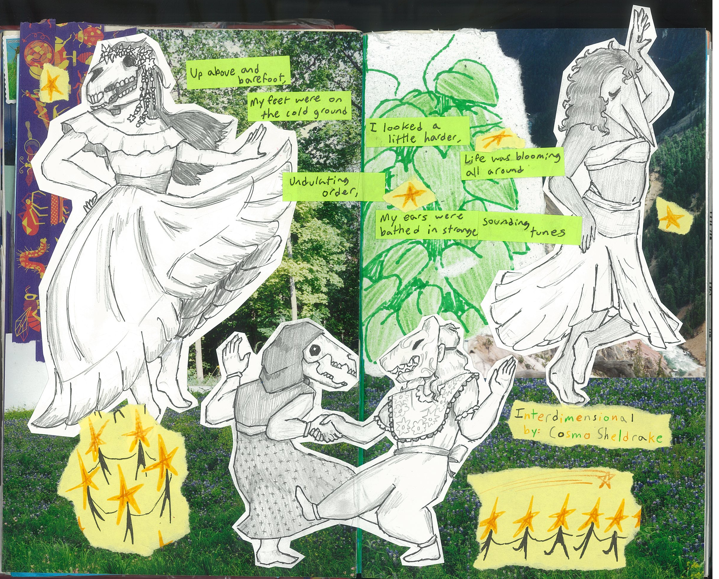
Spread 3: "Favorite Song"
Call me a broken record the way I be repeating stuff but I really really like this spread! I revamped it because the last song it was about ("KATAMARI" by femtanyl) sucked dookie and I am so proud of how it turned out `,:) The song it's about now is "Interdimensional" by Cosmo Sheldrake that I've been liking for a while now. I did this before umm finals I think so I really had to rush in order to finish it but I think I did really good in the amount of time I had!
The background is mostly comprised of old photographs I got from this art thriftstore close to my house I've been hoarding for a long time. The plants in the middle are solely there in order to fill in empty space cus I didn't want to waste another photo. The figures were cut out from a seperate sketchbook and are really roughly sketched and lined but I feel like that adds to the very natural movement of the song itself. (That you should totally listen to by the way because Cosmo Sheldrake is awesome!!!! please please please pleas) The little star guys and the lyrics are cut out from sticky notes cus I was running out of time and ideas on how to spice it up. But even though it's not as decorated as some other spreads, it came out really good. I love music so much bro
Spread 4: "Zentangles"
This one kinda sucks. I don't like it and I don't like making zentangles. I don't have anything to say about it anyways.
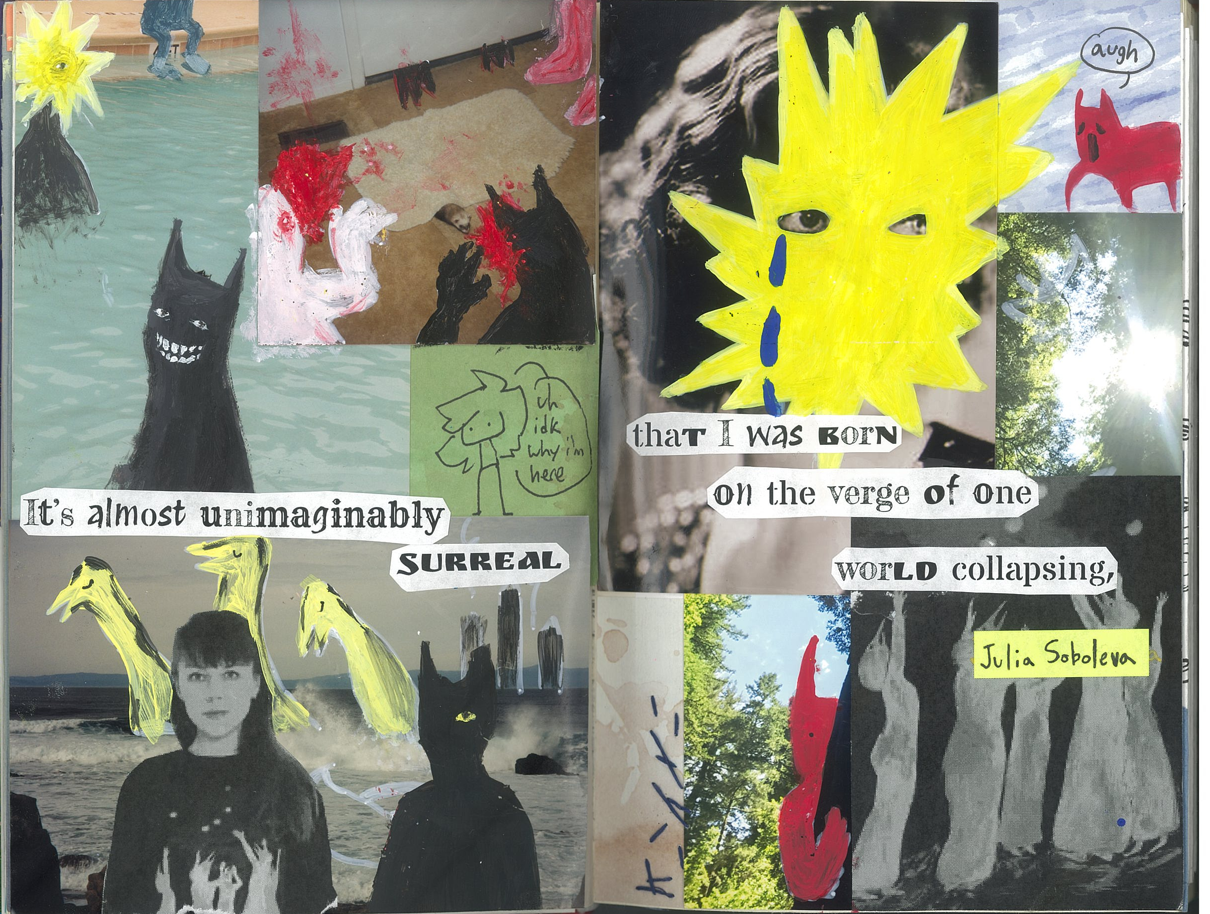
Spread 5: "Favorite Artist"
Julia Soboleva my beloved
This is kinda the first time I tried to actually paint on top of any photos I have (how was that the case idk) because I usually glue things on top of it. I was scared I wasn't gonna catpure the kind of emotion Soboleva has in her works but I think I did the best I could. I had like two days to do everything and that included waiting for most of the things to be printed anyways. I still think I did a really good job though `,:] The quote in the middle is from her interview about her collection of paintings "I Found The Light In The Darkness" and it really resonated with me because yeah, I am living up on the verge of a world collapsing and it's terrifying and unknown. I really want to go see her art in person, that's on my bucket list
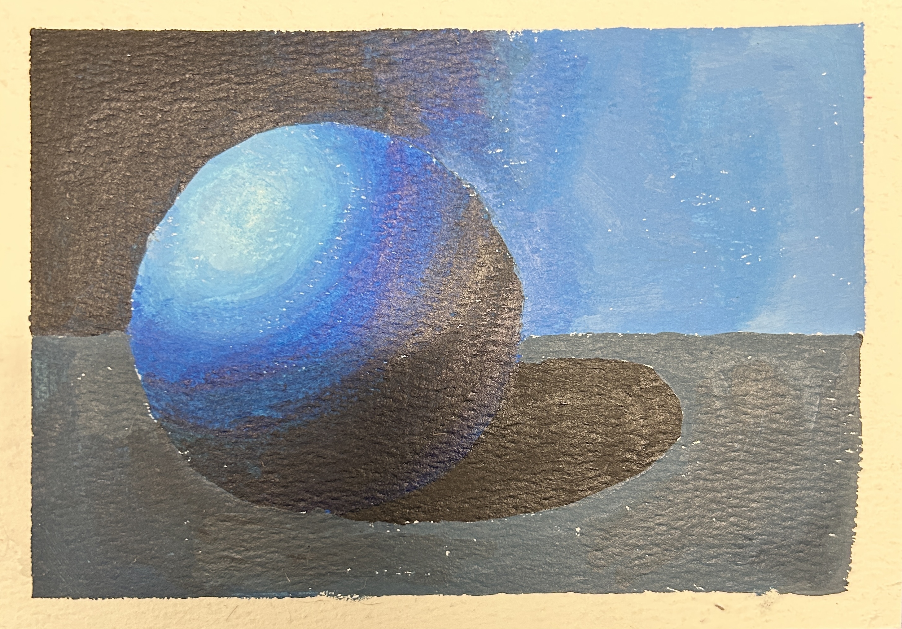
Painting Practice: "Ball"
All behold the B A L L
A regular degular value practice with paint but hey, I think I did pretty good. I wanted to get as much texture as I could from the paint but also make the blending kind of nice too. And also I took this on my phone so the contrast is like way out of jack so like...uh yeah :p it really is just a ball. What else am I supposed to say
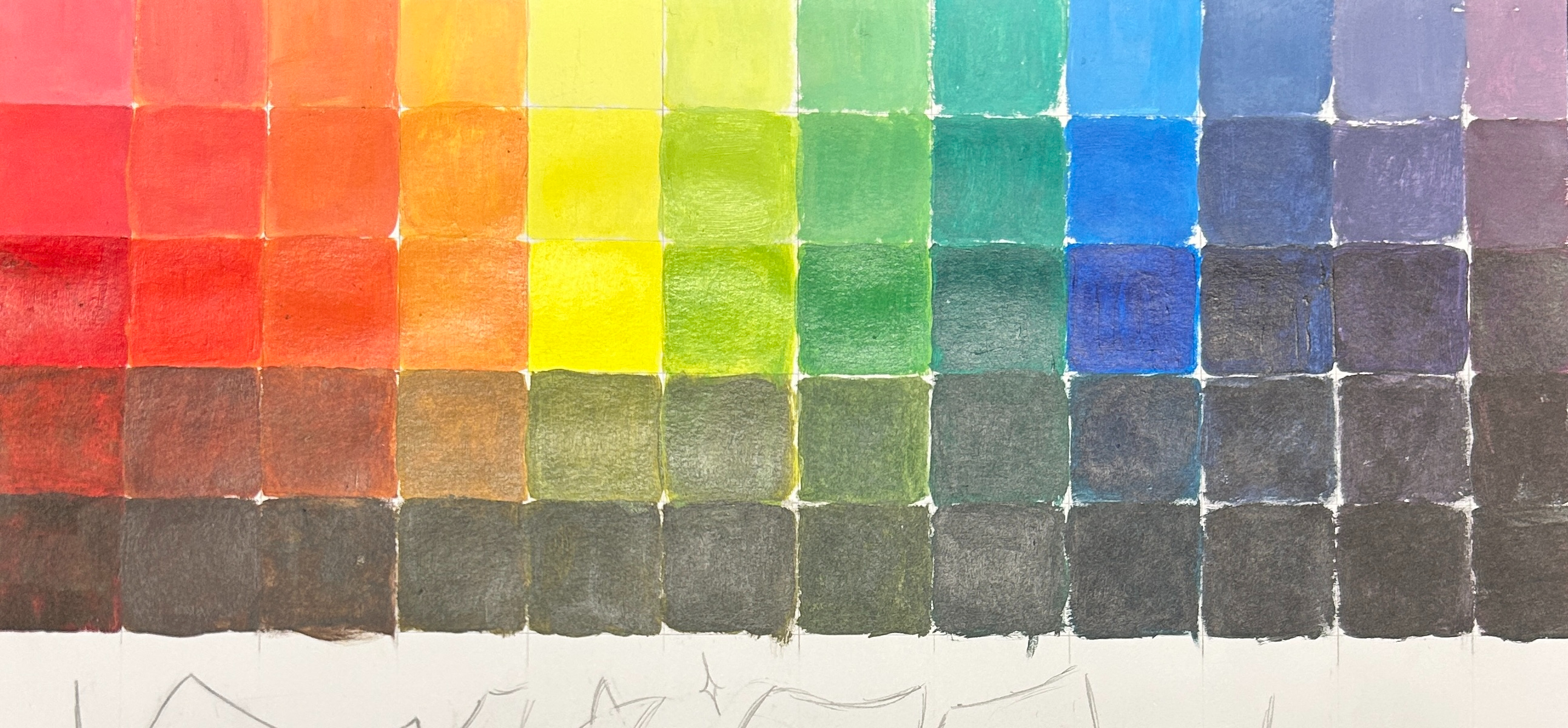
Painting Practice: "Color Mixing and Values"
oooo pretty colors ooooo yay yay hooray
yeah another painting practice. mhm
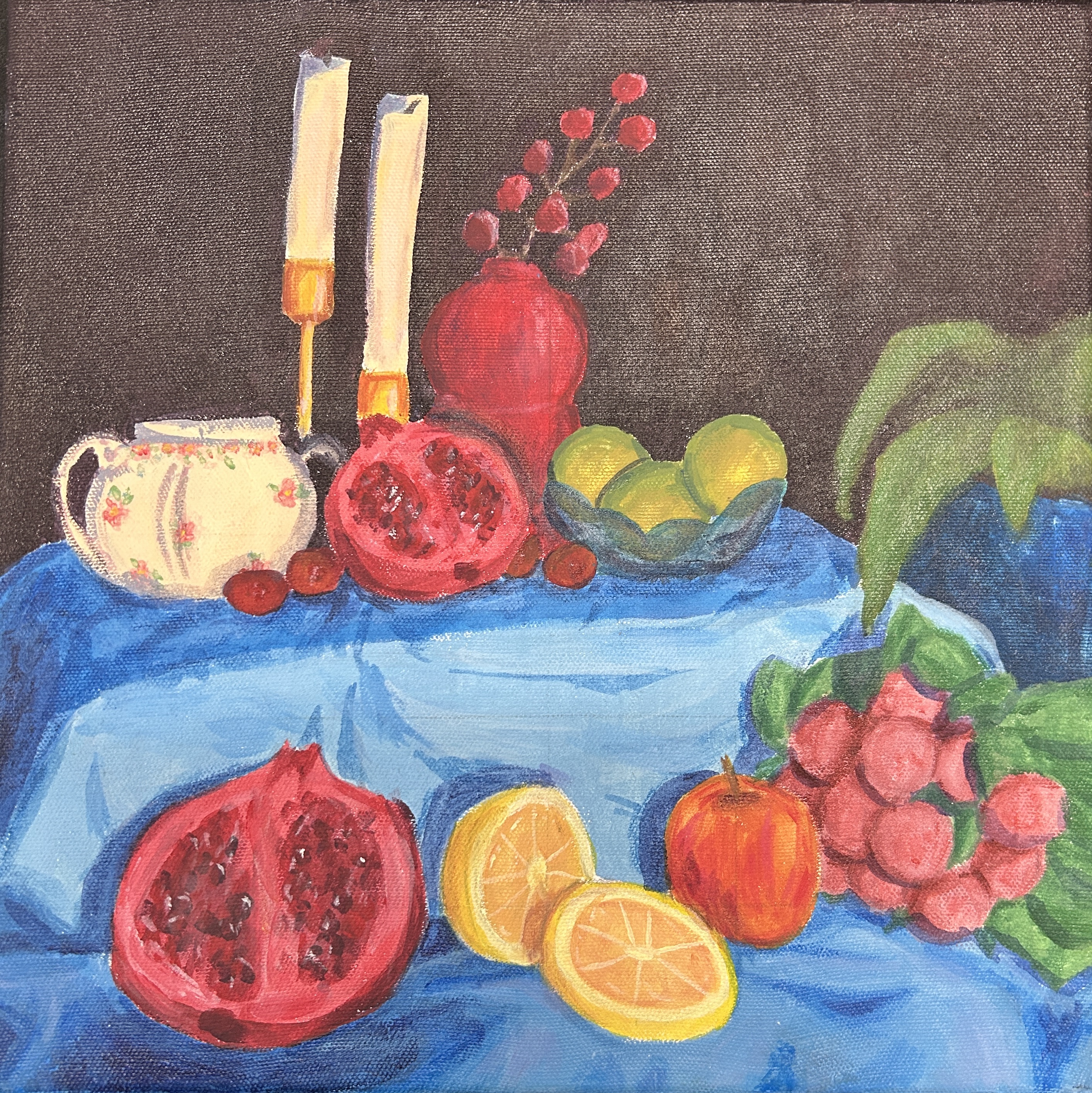
Still Life (yay)
Bruh I cooked with this one I COOKED!!!!!!!!!! It looks way better in person, I have no idea why it looks so bad I tried to take a better picture but eh I still really like how it turned out :3
I was pretty nervous starting this project actually because I had never done a still life before and I was really concerned with making it as realistic as I could. And then I realized....I really don't give a fuck...I can do whatever I want....and so I made it more contrasting and brighter cus previously I had used really muddy colors. I think I did really good though! Painting the fabric is what got to me ughhhh I hated painting the stupid fabric >:[ I really like dis one tho
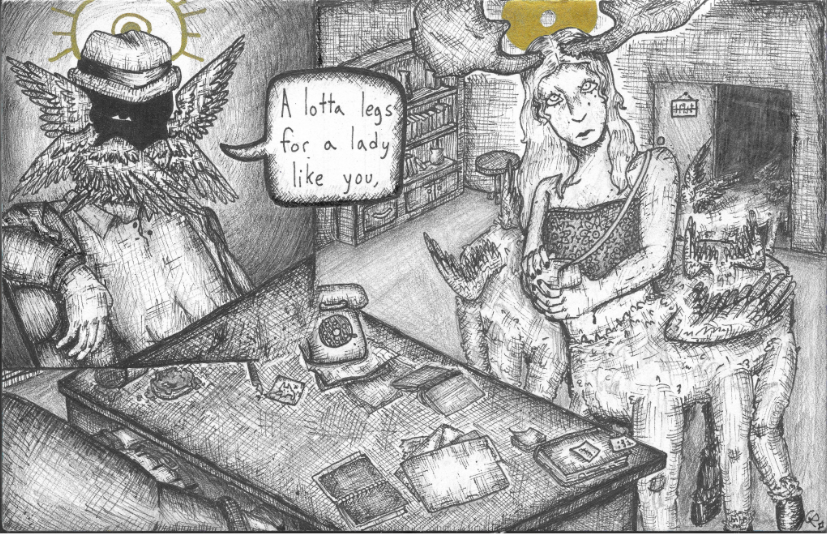
Detective Vano: "The Prolouge"
This one....I like this one >:3 It's a scene from the beginning part of my series of short stories called "Detective Vano in The City of Angels" that I also have posted on my website along with the piece of art itself! (and DONT say that it takes place in Los Angeles it is NOT in california its in HEAVEN and that is why it's called the city of angels cus they're actually ANGELS not high tax rates and shitty commuting times!!!)
Bru can we talk about the shading in this piece cus my hand is still hurting from the literal weeks this took off of my lifespan owwie I was like "Hey wouldn't it be so cool if we had the style of it be gritty and all cross-hatching??" Why do I do this to myself. Like genuinely. Genuine question for me. I still really like how it turned out, it gives off that very cold noir vibe with the absurdity of the setting. Please read the piece behind it! I think I did good on it and plus you'd get the context on what's happinging in this place anyways :P
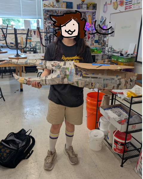
Epic fucking bug art project for school
(+ kind of face reveal? idk) YAY I love this thing so much I've been working on it for nearly a month!!!! I think i don't exactly remember when I started it but I do know I have been working on it for a while and it looks pretty fucking cool! hehehe :3
It's a Hercules Beetle and I plan to make big cellophane wings after I'm done painting AND there's an empty space in the body of the beetle where I'm gonna put like my room and stuff! It's gonna be so fucking cool!! YAY! I'm debating on whether or not I should put string lights but eh whateverrr